Recently we went through a logo and brand re-design here at Honey Bear Digital. We loved the bear logo but felt that it was time to update our look and feel. The previous logo was great, but it was a bit dated, and also looked a bit like a character out of a children’s book.

We wanted to re-design our brand to be a bit more modern, but also stand out within the sea of digital media companies. In order to move Honey Bear Digital into the next level, we engaged Mason McFee to help us create and design a new look and feel for our logos and website. As you can see, the website is already updated and we’ll continue to refine and build it out. Our new main logo is modern, flat, and still incorporates the bear, but not so cartoony.
The new logo represents a large bear nose, that shows he’s already found the honey, or that sweet spot for our clients. It also incorporates a new modern font for us to utilize in our marketing collateral and throughout the website.
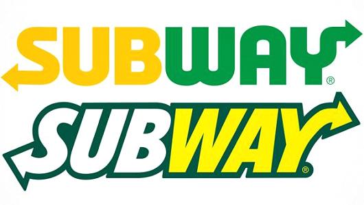
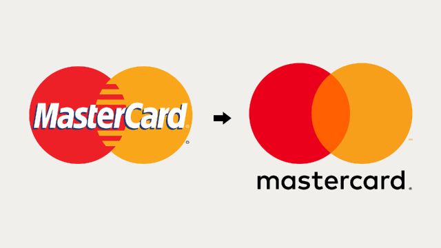
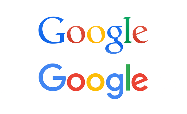
Another main reason for the new logo, is that we’re following the lead of some of the largest brands in the world. All of these companies recently redesigned their logos to a more flat, modern, simpler look.
Google & Subway updated their logos this year:
 |  |
 | 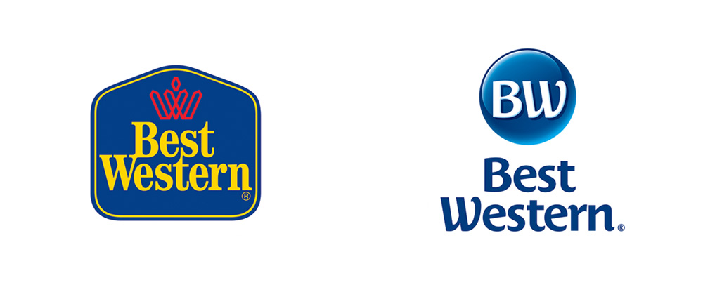 |
MasterCard and Best Western went through an update as you can see. These new takes on big brands’ logos are refreshingly simple, and are just what we were aiming for with our re-design.
We’re quite happy with Honey Bear Digital’s new look and feel. We’d love to hear what you think!

